Thursday, 29 March 2012
Wednesday, 28 March 2012
Reflection on Audience Response
In reflection on audience response I think that they commented fairly and since we received positive reviews, i'm glad of what we accomplished with our music video in the end. All of the comments said that our sychronisation was on point so it looked like he was singing. However, he had problems acting and really committing to the role, so it was understandable and didn't come to s surprise to us that one of our audience responses commented on that point. They also thought that the music video was cheesy whether it is a good thing or a bad thing, people have different opinions on how they would enjoy that kind of song.
Olly Patriarca's Website
Please enjoy Olly Patriarca's Official Website:
Tuesday, 27 March 2012


Problems We Faced With The Website
During the process of designing the website we came across some problems, for example since there was a troubleshooting with the website, we were disrupted by this and were unable to continue to to work on the website. We were then able to access it again after the school technician came to fix it but when we decided to work on it together at home on separate computers (logged in at the same time) the website malfunctioned again, and we were forced to stop working on it. In the end we managed to finish Olly Patriarca's Official Website with 9 pages.
Olly Patriarca's Merchandise


Sunday, 25 March 2012
Reflection on process of digipak and the effectiveness
I think that the digipak suit that urban pop theme, for the front page, I wanted him to be serious and the hands show that he is giving himself to his fans the second panel is a image of him smiling with his Ray Bans tilted to show his personality has a charm to it. The font I used at the Front cover, has buildings are the bottom of the letters to show a city scape, because in the City, that is where people get famous. The CD has a brick wall design to put emphasis on the urban pop culture. The forth panel is him and his winning smile to win his fans over and excite them of whats to come in the album and the fifth panel is him in the middle of the road, which shows he is a risk taker and also linking in with the urban pop theme. Finally the last panel, the track list, is again a brick wall at night time, the font is consistent to avoid tackiness. I chose to scatter the tracks downwards to create a messy look to again tie in with the Urban theme.

Britney Spears - Female Fetale Digipak Art Work

This digipack is quite simple but elegant at the same time, the alum is consistent keeping with the main three colours black, white and gold which matches Britney's complexion but also the uprising to a different type of star image for her as of her previous albums. For example, 'The Circus' which had a 'Carnival' theme to it. This album has a different outlook on Britney to her fans as she comes with an elegant and rich approach. The front cover is a close up of her face, with a promiscuous expression. The feather boa represents fame and entertainment but also being rich with her long flowing golden hair so these are the kind of themes she is trying to represent to her fan base. This is a contrast to her earlier life of going over the edge when she was on the break with Kevin Federline.
The second and fourth panel are just logo's with a signature design/ touch to them which emphasises on the elegance and the seriousness of her album. There is then a image of her in between the two logo's of her seductively posing, which links in with Goodwin's theory of the male gaze, to which it illustrates that there would be a male fan base as well as a female base. Females would be attracted to that picture because who ever is a fan of hers, they obviously look up to her so, Britney is also in fashion, so they would like to dress like her and aspire to be like her.


Reflection of progress in editing and decisions made
During the editing process, we decided that we had to colour correct some bits of the music video to suit the mood and the atmosphere in relation to how the artist is feeling. So when he was performing by himself the lighting would be darker then per say when there are scenes when they are together, the lighting would be brighter. For example when Charlotte and Olly are in the Park with Balloons, the lighting is brighter therefore making it a happier scene which will portray amongst the audience.


We also added a fade in at the begging to start the music video in a smoother way rather than it just popping up out of no where and at the ending we have also added in a fade out, so the music video doesn't suddenly cut.
While editing we have used transition effects to separate the scenes that are positive from the negative and to show how they link. For example, we used the additive effect between the scene where Charlotte kisses Olly's picture and the scene where Olly is looking at the engagement ring, the additive effect shows the twos mixing into each other. This goes to show that they are both thinking of each other and the effect heightens the belief.


 We also used dissolves to show that time has gone by, for instance we used it between the scene where Olly is singing by the window in his straw Federo hat and jean jacket and the scene where Charlotte come back, this illustrates to the audience that time has passed by and that it didn't happen all in one day.


We also added a fade in at the begging to start the music video in a smoother way rather than it just popping up out of no where and at the ending we have also added in a fade out, so the music video doesn't suddenly cut.
While editing we have used transition effects to separate the scenes that are positive from the negative and to show how they link. For example, we used the additive effect between the scene where Charlotte kisses Olly's picture and the scene where Olly is looking at the engagement ring, the additive effect shows the twos mixing into each other. This goes to show that they are both thinking of each other and the effect heightens the belief.


Problems We Face! DUN DUN DUN!
During the making of the music video we had to over come some obstacles during the process, for instance, during filming we had a problem with Olly trying to sing along with the song. Although he was singing along with it, at times he didn't get the words right and had trouble mouthing them right for the audience to believe that he was singing the song. So then we would have to started again, or when we didn't realise it until the editing process we had to re-shoot again.
Another problem we faced was the lack of availability of our actors as he was from a different college, we obviously did not have similar time tables so it was quite difficult to get the right bookings for filming days, we had quite a few cancellations because of this situation. However, it was alright in the end.
The final problem that was came across was Final Cut, as we were not used to the program, since in AS level we were using iMovie as it was the only software that was available for us at the time. We did not have enough time to be tough final cut and had to learn it ourselves by tutorials that were given to us and through YouTube. This took a toll on uploading our footage as we had problems capturing it to the Mac, so it took us 3 days and 3 uploading times to upload our footage at the beginning. Soon after, we got the hang of uploading and there were no problems.
Another problem we faced was the lack of availability of our actors as he was from a different college, we obviously did not have similar time tables so it was quite difficult to get the right bookings for filming days, we had quite a few cancellations because of this situation. However, it was alright in the end.
Communication
Throughout the making of our music video, me and my partner sophiya had other ways of communicating when we were not available for one another. One of these methods was creating a group called 'Media Group' on Facebook that allowed us to communicate by writing on the wall, expressing our views and opinions and figuring out decisions that had to be made. No one else could see what we were writing in this group as it was a private group that we could share documents and videos. Another way of communication was through the phone via texts and phone calls.:


Decision on Record Label Name and Logo
Saturday, 24 March 2012
Rhianna Digi Pack - Album Art

At the front of the album her tattoo is shown on her neck purposely to show that the old Rihanna is still there, so that her fans know that although she may have changed, she still knows where she's from. This also shows her rebellious side, which is in contrast with her pose in the image and the innocence she is trying to show. She is illustrating that she maybe be good but she has a little bit of wild side in her, which links in from her previous album "Good Girl Gone Bad".
In this digipack there a recurrent theme or roses ( even on the design of the CD's), which could again emphasis on love and lust . Roses also symbolize soft and delicate, which ties in with the white dress that she is wearing giving off that kind of aura. Inside the album there is a panoramic image of her lying in a bed of roses and although roses are beautiful and symbolize love, there are also thorns on the stems which could mean that love can be hard and have its ups and downs but also it takes pain to get to a beautiful ending. The theme of roses are also used for the audience so that when they think of roses they will think of Rihanna and when they look back at her they will remember her Red/ Roses Period
Thursday, 22 March 2012
Beyonce - Greatest Hits Digipak Analysis Artwork


It shows that Beyonce is a woman of capability as she is able to pull off the delicate flower to a dominating woman, which of course appeals to both female and male. It appeals to both genders because on one side she goes for the sexy look which appeals to men and the other side is the beauty in which females admire from her.
The colours that are used in this album are brown and black. The first CD design is a record vinyl design to emphasis she is going down in history and her to stay . The style of font that is used mixes in with the RnB pop genre and personality; by using feminine graffiti instead of the typical street graffiti that you would find on the walls in the streets
Wednesday, 21 March 2012
Lady Gaga - The Fame Monster Digipack Analysis Artwork


Although lady Gaga's digipak is simple as it uses the simple white font ( which stands out ) and the pictures are in black and white, it brings out a expressive and strong statement to her fans. The front cover is a mid shot of her in a latex coat, with her white 'hay' like hair coming outwards. the latex coat brings out a type of 'cover up' for her to show that she may be the 'Monster' hiding but since her eyes are peaking out, they almost look like they are hawk monstrous eyes. Shows that she may be coming out or about to capture her prey, in this case it would be her fans or someone she cares about. This links in with the title 'The Fame Monster' because it is as if she is about to burst. Her hair is a great contrast to what she is wearing by colour. You may say that she looks crazy ( which people who are not her fans, normally think she is, because of her wild fashion sense.
the second panel is a picture of her sideways, with long black 'straw' like hair. I say 'straw' like because the way the raven is flying out of her hair suggest that the bird has made it's nest in her hair. When coming across the symbolism of a raven, suggests darkness and death because that's what you generically see in horror films if it was set in a cemetery. When linking to darkness, darkness links in with monsters and monsters are classed as positive things. This picture can also be interpreted by the fact that 'Fame' has turned her into a 'Monster' and that the picture represents her battle between a normal life and fame.
There are two CD's with the same type of design with just the simple font on them saying ' Lady Gaga The Fame Monster 1 and 1 '. The white block, bold and capitalized letters really standout to her audience as it is white on black. Finally that back panel ( track list ) is a close up of her long black hair again but her in a different pose. This time she has black tears rolling down her eyes to emphasis that she is the monster.
Monday, 19 March 2012
Dairy Entry 13 - Editing the Final clips
After uploading our work onto Final Cut we replaced and added the aspects of our music video that were not happy about and made sure all the sycronisation was complete, we took into consideration what we heard from our peer evaluation and made sure we ticked all the boxes that made our music video a success. After doing so, the music video was done and was able to upload it on to Youtube.
Friday, 16 March 2012
Diary Entry 12 - More Re-shooting, More Fixing
Today was a great success for me and Sophiya as i think that we accomplished our target today.We first started our day by filming the raining scene AGAIN, we started 10 am and made our way to Sophiyas house. We made sure that we got his lips syncing correct and there was sufficient enough water coming from the hose, so that it did not look fake. We then hit a speed bump when we realised that there was hardly any battery left on the ONLY battery we had, so had to wait a while for the battery to charge which was very time consuming. An hour went by and the battery charged up by not much which wasn't good because we still had to film the Cafe Scene, the River Walking Scene, Piano Scene, Charlotte kissing the mirror Scene and Olly's Ending. So we had to plan out and time what exactly need to to be done so the battery would not die out on us.
We made our way to Kingston Starbucks, where there were chairs outside and we decided to film there. However, we need a 'couple' to be our Cafe scene but it was a good thing our actor Olly knew someone that helped out and a woman was kind enough to help out as well. After that we went to the River side and filmed the bit in the song where it says "the end the end the end" because we decided that it would make the music video more powerful synesthesia.
It got to 3:30 so we went to Charlottes house to film the piano scene, Charlotte kissing a picture of Olly and Olly's Ending. All in all i think that we made sure everything went right and that we made sure we had a variety of angles and shots. However, we were rushed quite a bit with Olly's ending as one of our actors had to leave and we were using their place so we had to rush so I wasn't really pleased with the ending and there was no way we could have done it again. Olly's ending didn't turn out too bad and we decided to use it anyway.
Thursday, 15 March 2012
Katy Perry Digi Pak - Album Art

 This is the Digi pack of Katy Perry's 'Teenage Dream' album, as you can see the theme of the album is Candy this meshes well with Katy Perry' personality as is represents herself,
showing that she is a "Sweet" person but also has a colourful
personality. This could also mean that she is also quite innocent, but the fact
that she is naked on the front cover, contradicts this. The two CD designs have a donut and a candy cane pattern on them and on the track list,
(which is at the back of the album) are mixed with normal letters and candy chaped letters with keep in with the theme of candy theme. The digipack ties in with the genre of music as it relates to
her style of music and also gives the audience the idea that her music is not
serious and is more on the fun side. Although the Katy Perry has a wide fan base and has a variety of different fans. The digipack would predominately appeal to
females, as they use pinks, whites and light blues. The fact that the
albums uses that candy theme, represents females and also coming from the nursery rhyme:
This is the Digi pack of Katy Perry's 'Teenage Dream' album, as you can see the theme of the album is Candy this meshes well with Katy Perry' personality as is represents herself,
showing that she is a "Sweet" person but also has a colourful
personality. This could also mean that she is also quite innocent, but the fact
that she is naked on the front cover, contradicts this. The two CD designs have a donut and a candy cane pattern on them and on the track list,
(which is at the back of the album) are mixed with normal letters and candy chaped letters with keep in with the theme of candy theme. The digipack ties in with the genre of music as it relates to
her style of music and also gives the audience the idea that her music is not
serious and is more on the fun side. Although the Katy Perry has a wide fan base and has a variety of different fans. The digipack would predominately appeal to
females, as they use pinks, whites and light blues. The fact that the
albums uses that candy theme, represents females and also coming from the nursery rhyme: 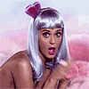 "What are little girls made of?
Sugar and spice,
And everything nice,
That's what little girls are made of."
Emphasises on girls generically classed as being "sweet". Although, this appeals to females, there is also
a male audience as shown on the front cover she is naked in the clouds portraying a sexual
and provocative manner.
The iconography represents her overall image and links in with her music video for her single 'California Girls' which had a candy theme to it, where everything was made out of candy. Through out music video history this type of theme has not been done, which goes to show her uniqueness and will make sure that her audience will remember her 'candy wonderland' period.
Wednesday, 14 March 2012
Diary Entry 11 - Fixing STAGE (Time to re-shoot some scenes!)
Today we filmed the the reshooting of Charlotte coming back and added a new performance scene to the music video where Olly stands in front of the window and sings. During the filming of the performance by the window, we tried to make it rain outside by spraying a hose on the window but it did not look realistic, so we had to trash that idea and just went with a sunset background which turned out to look much better in the end. The next scene was when Charlotte comes back to Olly which, in the past, we found quite difficult to film it right. Before the filming day we had to make sure that we knew what kind of shots we needed and planned it precisely. All in all the day went brilliant and I am glad we got the ending to a 'T'. This time i think that we created a more emotional but happy ending to engage the audience.
Tuesday, 6 March 2012
Diary Entry 10 - Feedback from Peers!
Today we decided to have a peer evaluation to have a rough idea of what needed to be improved and what they thought was good. As a prosumer it helped us to find out who are target audience was and what they would expect the music video would be like with this song. Since our peer reviewers were teenagers, we thought it was a great opportunity as they are whats modern in this day and age, teenagers to young adults are digital natives in which create the information age. Here is the overall feedback that we received from our peers:
After receiving the comments, we decided that it would be best to look over what we had done and make sure the syncronisation was on beat and noted down everything we decided wasn't best suited for the music video. We also decided that we wanted to add more cutaways as we only had one in the first place. In the end we came to the conclusion that there were things that needed to be replaced and re -shot as the sycronisation of our actor was not on time and there was no other option but to re film. We were also worried about re-shooting because the deadline was coming close and there weren't a lot of days we were able to film due to the fact our actors were not able to film on certain days.
On our facebook group 'Media Group' We listed down the scenes that needed to be done for the next two days of filming and allowed use to make sure that we didn't miss anything.


- Strong, emotional and clear narrative
- A variety of camera shots
- Good use of lighting
- Mise-en-scène/costume reflects mood
- Enjoy the ‘abstract nature’ of the balloons and the symbolism they hold
- A strong urban star-image of the artist is constructed through the music video
- Some bits are not synchronised
- Ending is ‘boring’
- Requires more close-ups of artist’s reactions (e.g. when Charlotte returns home)
- Some shots are out of focus or too dark
- More cutaways are needed
After receiving the comments, we decided that it would be best to look over what we had done and make sure the syncronisation was on beat and noted down everything we decided wasn't best suited for the music video. We also decided that we wanted to add more cutaways as we only had one in the first place. In the end we came to the conclusion that there were things that needed to be replaced and re -shot as the sycronisation of our actor was not on time and there was no other option but to re film. We were also worried about re-shooting because the deadline was coming close and there weren't a lot of days we were able to film due to the fact our actors were not able to film on certain days.
On our facebook group 'Media Group' We listed down the scenes that needed to be done for the next two days of filming and allowed use to make sure that we didn't miss anything.


Monday, 5 March 2012
Moodboard
This is a mood board that incorporates our Music Video "What We Started" showing what we are trying to put across by his emotions and how he feels about the girl he loves.
Thursday, 1 March 2012
Tweeking This and That...
After receiving critical and good comments from our Peers, we decided that there were some aspects of our music video that needed touching up or redoing. Although most of our peers found that our music video was emotional at the end, they had also commented and said that it was a little boring seeing as they could not see the reaction of Olly's face when Charlotte comes back to him and the camera was a little bit out of focus and was a bit fuzzy to look at. So therefore, we decided that we should redo that scene again to create a better alternative to the ending.
Another aspect we decided that we should add was that there should be a memory of Charlotte opening a present from Olly and a card on their Anniversary (through his eyes, so a POV shot) and we also thinking of adding in Charlotte looking at a photo of them on a mirror and kiss it, leaving a lipstick mark on it, showing that she misses him after all that he has done. As of at the moment the audience does not get to see much of Charlotte then they should.
We are also adding in another performance scene as in one of our comments, said that there wasn't enough performance so this time Olly will be singing down a street whilst walking and we are also adding a scene where he is singing in front of a big window while it rains outside. We also decided that it would be best to add cutaway shots that symbolise the emotions and the atmosphere of the music video and how he feels about her like:
- Tap dripping
- Birds flying in the sky
- Sunset
- Clock face
We are filming the cutaways on Tuesday the 6th of March and then filming the rest on Friday the 9th of March!
Star Persona Influences
Olly Patriarca's star image was influence by urban pop male artist from bot America and Britain as these are the countries that generate the starts of our generation but also encouraged a universal appeal rather than just one fan base. Researching popular male artists, i came across Bruno Mars, Olly Murs and Jason Derulo. We came to the conclusion that we wanted our male artist Olly Patriarca to pursue that kind of persona.


 Bruno Mars is one of our main influences because he is right now one of the hottest stars at the moment. With his edgy rock n' Roll style, and his outstanding vocal abilities has got his a hit with the ladies and a role model for his male fans. And when fans look up to him they also want to dress just like him. To complete that edgy look, he adds accessories, such as Ray Bans, a Fedora, a necklace and a ring. This is what we used for some of the scenes and photo shoots for Olly Patriarca.

 Furthermore, another artist that influence us was Olly Murs, as he obtains a more clean cut look. Normally wearing a Fred Perry shirt, shinny chinos/ trousers, belt and a fedora. Olly Murs follows the 90's Brit pop movement from Oasis but adding his own modern touch to his look.


 Bruno Mars is one of our main influences because he is right now one of the hottest stars at the moment. With his edgy rock n' Roll style, and his outstanding vocal abilities has got his a hit with the ladies and a role model for his male fans. And when fans look up to him they also want to dress just like him. To complete that edgy look, he adds accessories, such as Ray Bans, a Fedora, a necklace and a ring. This is what we used for some of the scenes and photo shoots for Olly Patriarca.
 Furthermore, another artist that influence us was Olly Murs, as he obtains a more clean cut look. Normally wearing a Fred Perry shirt, shinny chinos/ trousers, belt and a fedora. Olly Murs follows the 90's Brit pop movement from Oasis but adding his own modern touch to his look.

Subscribe to:
Comments (Atom)